Tip #49: How to Design Your Membership Site’s Error Pages to Increase Conversions
 April 19, 2015
  1 Comment
The error page is a very important part of every membership site as people who land on an error page clearly found your content interesting enough to click and try to enter it.
By designing your error page properly you can increase your conversion rates and your revenues tremendously.
4 Different Designs for Your Error Page:
Design #1: Sales Page
Designing your error page like a sales page can help increase your revenues tremendously, especially if you have already split tested several different sales pages and you know what design helps you sell your membership site better.
You can use a simple plugin (free) that will display your sales page inside your error page. The plugin is called Post Content Shortcodes and it will display your sales page by using a simple shortcode that looks like this: [ post-content id=X ]
All you need to do is replace the X with the sales page’s number (this is the page’s id that can be found inside the URL when you edit the page).
The great benefit of using this plugin is that every time you edit your main sales page, your error page will also display the most updated sales page automatically.
Example – Wishlist Insider Error Page:
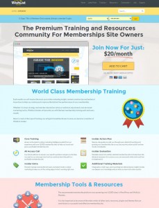
Wishlist Member are using a sales page like error page to sell memberships to their online community – Wishlist Insider, as can be seen in the below screenshot (click to enlarge image):
You can see the complete design of the error page by clicking on this link and trying to enter content
Design #2: Memberships Comparison Table
Comparison table of the current membership level vs. more advanced memberships.
Comparison tables is an excellent way to explain the differences between the memberships and what the member will get when upgrading in a very clear and visual way.
Example – OptionAlpha.com Error Page:
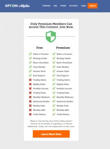
An example of an error page like this can be found in a website called: optionalpha.com, as you can see in the screenshot below (click to enlarge image):
Design #3: Straight Forward Call to Action
We see many membership sites’ owners that prefer to have a clean error page, some keep the original Wishlist Member plugin text: “The content you’re trying to view is for members only. Please register in order to access this content.” or replace it with a different call to action.
Example – Platform University Error Page
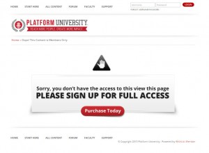
An example of a clean error page can be found on Michael Hyatt’s Platform University website as can be seen in the screenshot below (click to enlarge image):
Design #4: Dynamic & Targeted Error Page
The smartest way that will also increase your conversion rates is to create dynamic error pages that will be targeted to each non-member specifically according to the protected content each non-member tried to access.
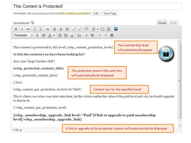
These targeted error pages are created automatically by Wishlist Error Page Booster smart shortcodes and these shortcodes display the following information: Status (current membership level), the protected content’s membership level, the protected content’s title and intro (“teaser”), a link to upgrade to that level and more…
Example Error Page:
Here is a simple example of an error page that can be created using the smart shortcodes:
You can find more information about Wishlist Error Page Booster here
10 Most Popular Wishlist Member Tips
On April 24, 2014 we started a weekly series with tips about Wishlist Member from our own experience and from questions and issues some of our clients have been dealing with.
Our tips series has become very successful and our tips are getting many views on a daily basis.
We have collected the 10 most viewed tips so far in one post:
- Tip #29: How to Choose a Theme for Your Membership Site Plus Recommended Themes to Use with Wishlist Member
- Tip #18: Which Forums Integrate with Wishlist Member?
- Tip #30: Most Popular Affiliate Programs that Integrate with Wishlist Member
- Tip #3: Must Have Plugins for Managing Your Membership Site
- Tip #31: Choosing the Most Suitable Shopping Cart Service for Your Wishlist Member Membership Site
- Tip #22: All about Members’ Stickiness – Keeping Members from Cancelling their Membership
- Tip #23: 5 Powerful Models to Pricing Your Membership Site
- Tip #26: Wishlist Member Membership Site Pre-Launch Checklist
- Tip #41: Pricing Your Membership Site – Annual vs. Monthly Charges
- Tip #16: Creating Coupons Using Wishlist Member Plugin




 “Just wanted to let you know that the plugin is working great and incomplete registrations have gone to zero! I’m definitely going to do a review of the plugin and get it for my own site.” MaAnna Stephenson BlogAid.net
 “Bob Tolbert’s Wish List Member plugins have made life easier on us by automating processes that would normally eat up a ton of admin time. I especially appreciate Bob’s quick response time and customer service. Fact is, our membership website would not function without these plug ins.” Michael Burwell TheHangoutHelper.com
 “This plugin is the best way to supercharge your membership signups. I was especially impressed by the developers prompt customer service!” Stan Smith PushingSocial.com
 “The Wishlist Auto Registration plugin is really great, I love it! And the support you guy’s deliver are really outstanding! Thank you so much!” Johan Skalberg kalisikaran.info







Trackbacks/Pingbacks
[…] Tip #49: How to Design Your Membership Site’s Error Pages to Increase Conversions […]